
A brand evolution for an independent technology specialist that needed to break out of a sea of sameness – while keeping every ounce of the trust its sectors demand.
Like a lot of technically brilliant B2B businesses, ITI Group had quietly blended into its own sector. We’d already created a strategic messaging framework to position them in the market and communicate what makes them unique. What was missing was the final layer: a brand that didn’t just look different but felt distinct.
The engineering, industrial automation, and systems integration sector has a sameness problem. Blue is the default – somewhere between a third and 40% of the world’s biggest brands reach for it, all chasing the same signals of trust and security. But the result is the whole sector blurs into one.
ITI sat right in the middle of it, with a 45° angle that boxed the brand in, and a palette that said “safe”. It was fine, but it wasn’t remarkable. And on the channels that matter – their website, LinkedIn, the show floor – it didn’t take up space.
However, we had to tread carefully. ITI Group works with clients across sectors including nuclear, life sciences, manufacturing, and food and beverage, where failure isn’t an option and seriousness matters. So, standing out couldn’t mean being loud for the sake of it.
The brief was to be bold without being reckless: distinct enough to be impossible to ignore, credible enough that a safety-critical client never doubts you for a second.
This was an evolution, not a reinvention. ITI has more than 50 years of heritage behind it, and that kind of trust isn’t something you gamble with; the job wasn’t to start again, but to sharpen what was working, lose what wasn’t, and give the brand the nerve to lead.
We started with a workshop. We showed ITI’s leadership the whole picture – their brand, their competitors, and the open space nobody had taken – then turned it into a before-and-after deck that made the argument plainly: when everyone looks the same, standing out is the safe bet, not the risky one.
We built the brand to work two ways – one identity that knows when to reassure, and when to turn the volume up.
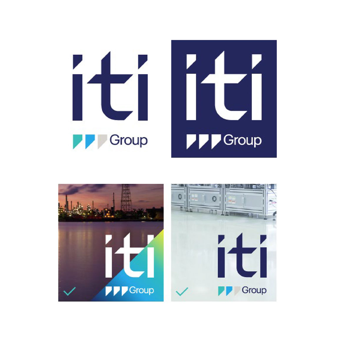
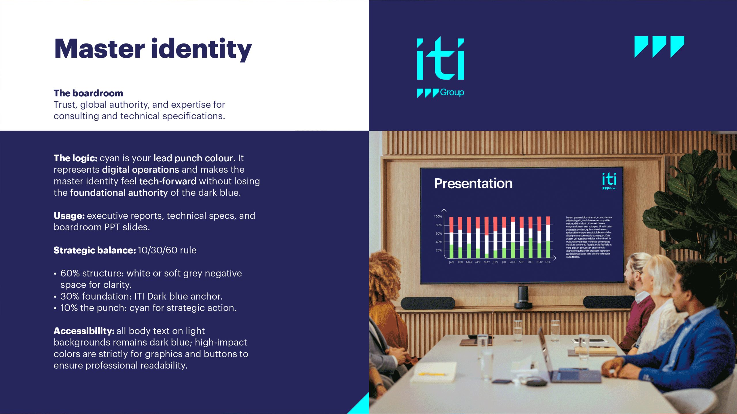
The master identity protects ITI’s credibility. It keeps the dark blue at the brand’s core – a nod to the heritage and trust built over five decades – and adds a single, disciplined punch of cyan. It’s measured and quietly authoritative: the version for board reports, technical specs and the rooms where credibility is everything.
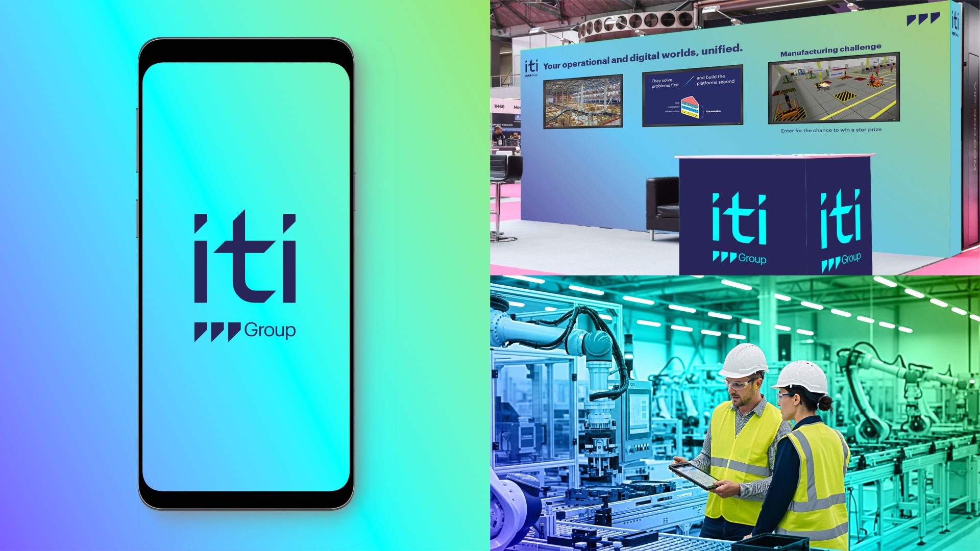
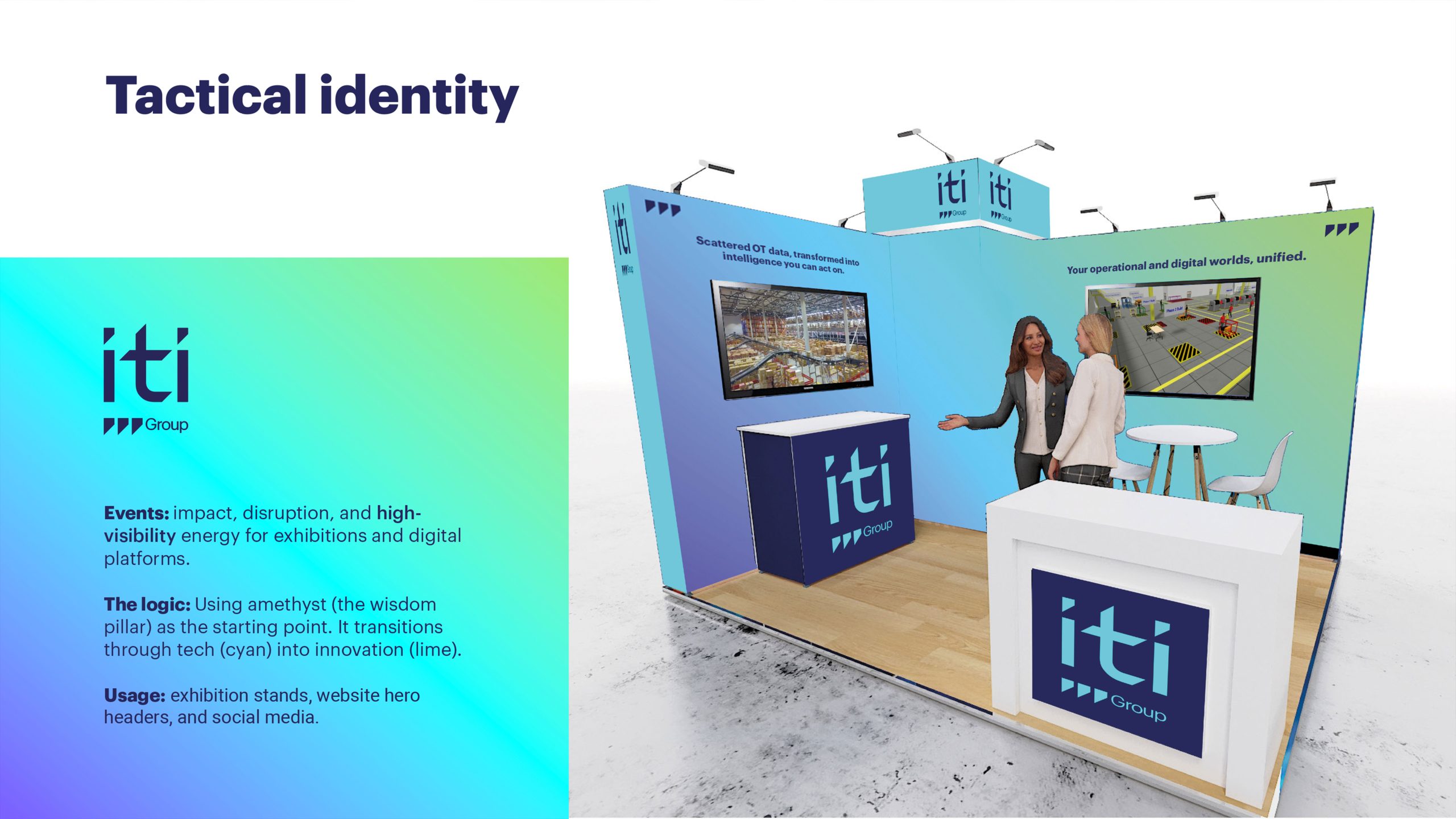
The tactical identity is where it gets loud. It runs a bright gradient through amethyst, cyan and lime, built to catch the eye in a crowded exhibition hall or a busy LinkedIn feed. It’s bold and hard to walk past – and still, clearly, the brand the boardroom already trusts.
It’s the same brand in two registers, with clear rules for when to use each.
Behind both is a colour system with real logic to it: every colour has a job, and a signature gradient ties them together, capturing the whole point of ITI in a single image – operational and digital worlds, brought together. A simple 60/30/10 split keeps it in check, so the brand stays bold without ever tipping into noise.
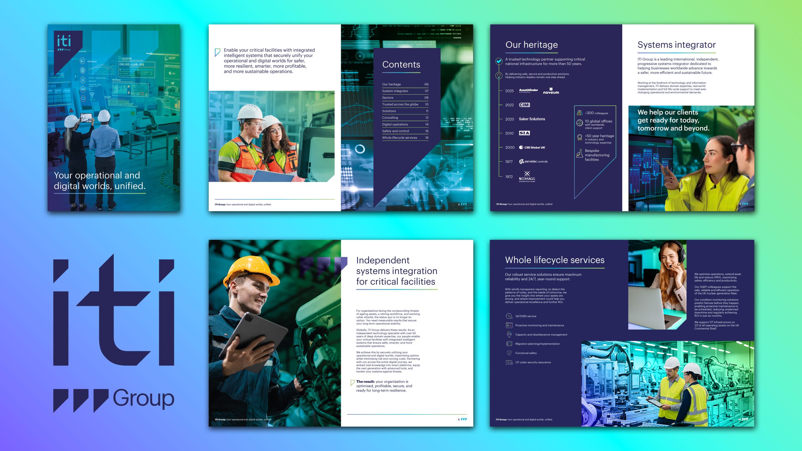
We had a clear-out, too. The slash and the 45° angle went. We turned the value proposition into a single line for the brand to lead with – Your operational and digital worlds, unified – and tidied the logo’s triple-mark into a proper shorthand: three staggered triangles for the “group” in ITI Group, dropping to one where space is tight.
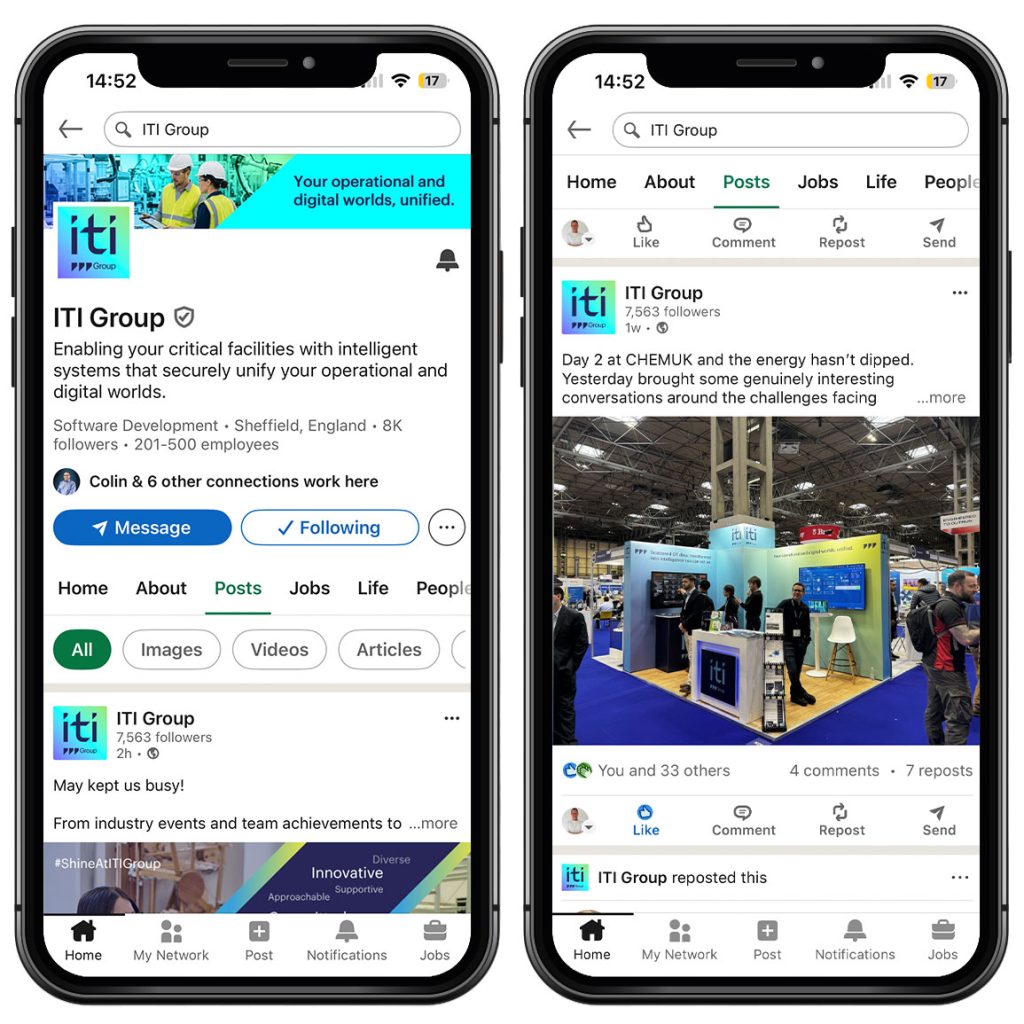
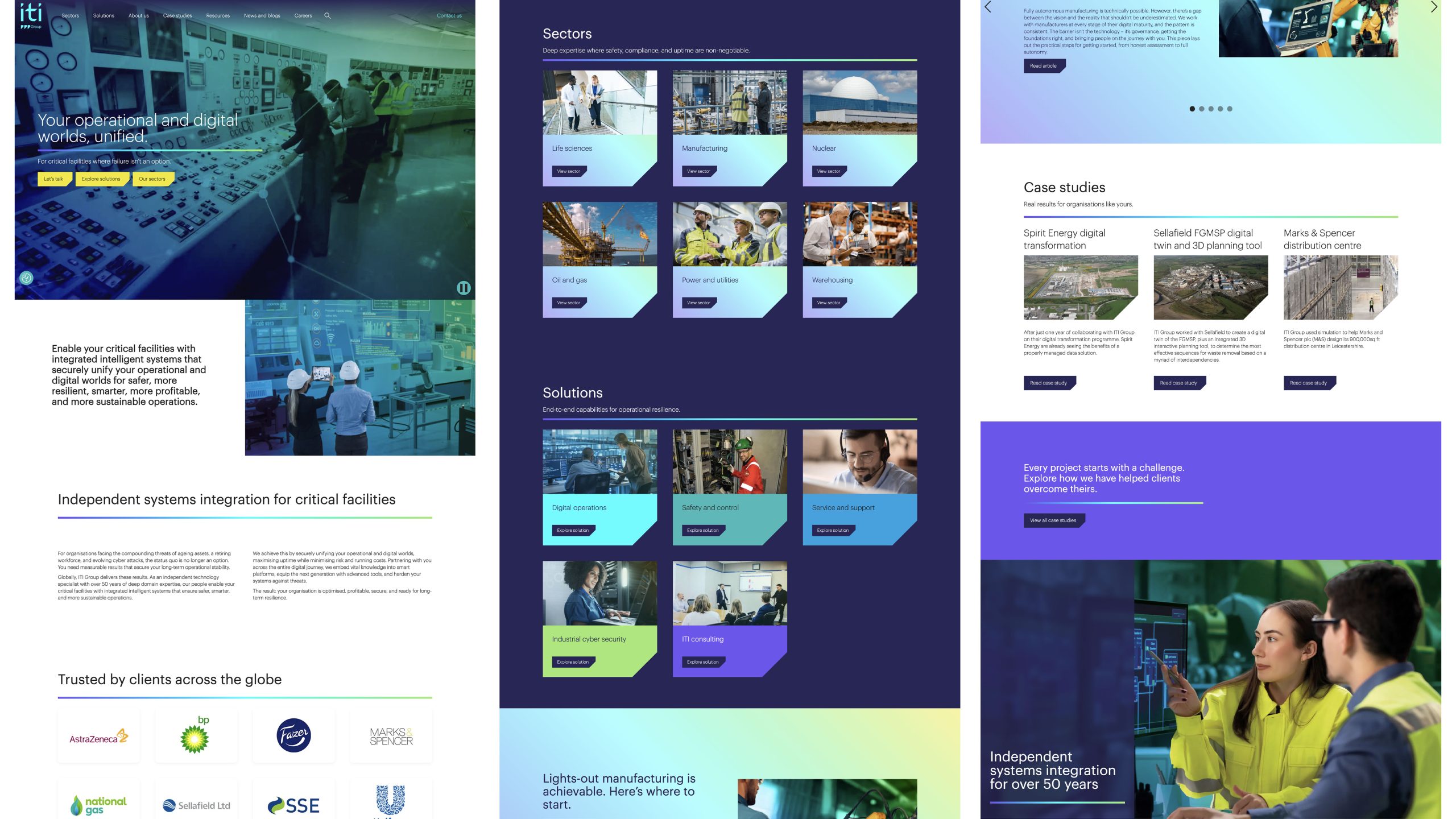
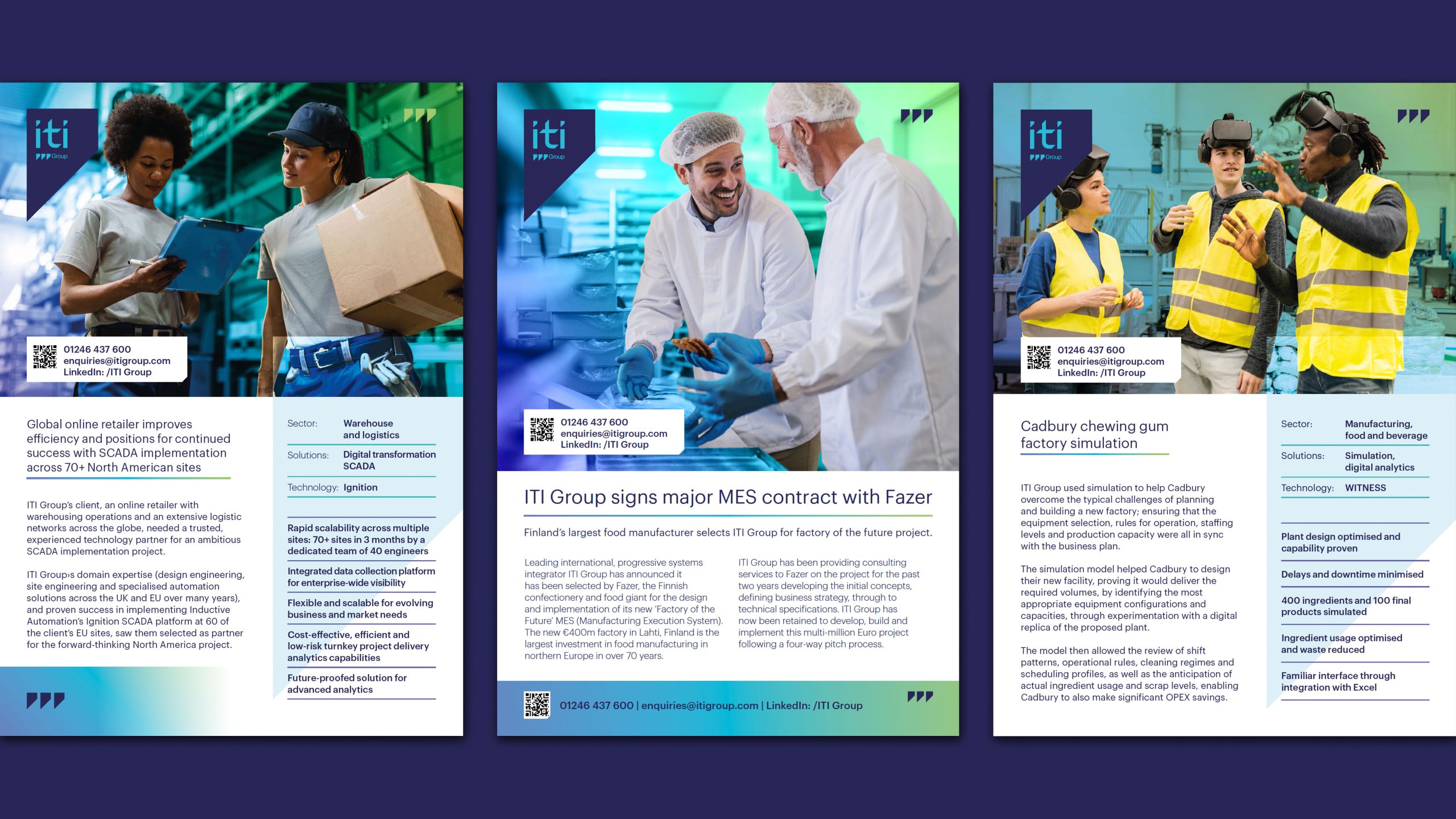
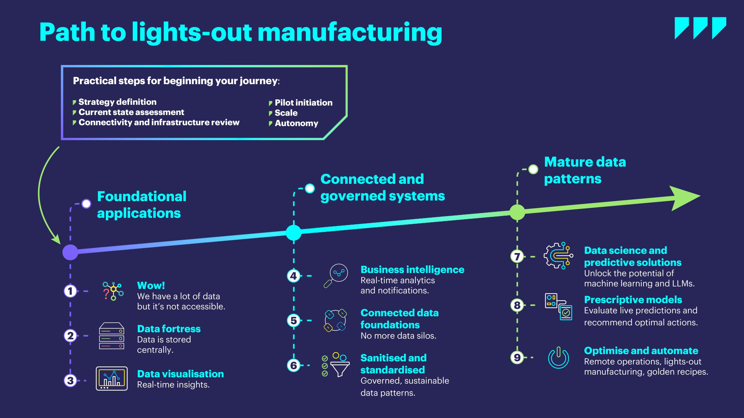
Then we set it moving. A ten-second looping hero animation – abstract data flow, built on the new look and made to last rather than date in six months – now runs across the top of ITI’s homepage. A brand only earns its keep if it shows up the same way everywhere, so we took it the whole distance: a refreshed website, a new sales brochure, stand graphics for ITI’s 2026 events, LinkedIn assets, and a pass through the sales decks, all held in line by one set of guidelines. It tells one story now, from a first glance on LinkedIn, to the stand, to the proposal that follows.

The brand stands out now – and it never once looks like a risk.
Proof on the show floor. ITI’s new stand came 2nd at CHEMUK Expo 2026 – exactly the test we’d built the brand for. It got noticed in a crowded hall, and it still looked every bit as serious as the work behind it.
Consistent, everywhere. The brand used to shift depending on where you ran into it. Now it doesn’t: it’s clearly ITI on LinkedIn, at an event and on the website, with strategy and brand finally pulling in the same direction.
Room to grow. With the two-part identity and one clear set of guidelines, ITI has a brand that can keep up as the business grows – serious where it needs to be, bold where it pays to be, and always recognisably itself.
We’re a team of creatives who are excited about unique ideas and help B2B companies to create amazing identity by crafting top-notch UI/UX.